
Pros and Cons of Templates in Webflow
April 30, 2024
7 mins read
.png)
So, you have successfully designed a website using Webflow, but did you think about making it responsive. A responsive web design is crucial for any business. Over the years, there has been a considerable rise in mobile phone users. With a customer base of more than 6 billion people globally, having a responsive website design that adapts to different screen sizes can tremendously impact the brand's visibility and awareness.
In the modern world, we cannot undermine the significance of a strong digital presence. Irrespective of the business niche, a brand needs to have strong digital visibility. There is no better way than a responsive website design that can instantly grab the attention of the user.
Whether you’re planning to build a professional portfolio, a vibrant e-commerce store, or a blog to share your opinion, the website allows you to claim your space on the World Wide Web. However, the conjugated process of website development and designing can be challenging for the tech neophyte.
In such a scenario, website building platforms like Webflow have proven to be a boon. Their interactive platform, along with built-in templates and drag-and-drop features, Webflow is one of the most preffered website design choices.
You can read more about using Webflow to develop a landing page, but this guide goes deeper into web low usage in creating a responsive website design. The step-by-step approach will highlight the process of drafting your website on this platform while setting the foundation for strong brand awareness in the world of the internet.
If you have been planning to create a website, you would have certainly encountered the fact that responsive web design is a must to improve the user experience. In simple words, a responsive design is compatible with mobile and works excellently on both small and large screens. It prevents visitors on mobile devices from needing to do extra work to read your content. The objective of creating a responsive web design is to improve the user experience.
It also avoids unnecessary resizing scrolling and reduces the loading time. Many times, it has been seen that websites having poor navigation on mobile have poor traffic as compared to the ones that have a responsive website design.
Webflow is a trusted platform for designing web pages. Whether you are looking for landing page development, e-commerce website design, or fintech design, there are an array of templates available on Webflow that make website designing a breeze.
However, for the ones who are starting afresh, it is important to move step-by-step. It will simplify the process. For better understanding, we have divided the responsive website design in Webflow into two parts. The first part talks about the pre-preparation phase, and the second part delves deeper into the actual design phase.
Before heading towards a Webflow visual editor, you should first focus on planning your website blueprint. For this, you need to:
Prepare the content and shortlist the images that you would want to add to the website. The objective of this phase is to create a user-friendly experience.
The next phase involves doing a bit of research, wherein you do a competitive analysis. It will help you identify the design elements, layout, and overall style that can have a good impact on the eyes of the visitor.
If you have a defined brand image logo, color scheme, or font, you can keep all these parameters as a center point while designing the framework of your website. This helps in creating a cohesive brand image.
Another important parameter that should be taken into consideration is the structure of the website. Create a visual representation of how the final website and webpages would look when they are linked together. It helps analyze and visualize the overall flow of the website.
If you are planning to go ahead with the more complex layout, consider creating basic Wireframes that will help in the placement of the content section before you jump into the design process.
Now that you have created a blueprint of what the website would look like, you can access Webflow and start creating a responsive web page design.
Now that you're armed with a content plan and website vision let's explore Webflow's interface and set up your new project.
The first step is to create a Webflow account. To do this, you need to sign up on Webflow and create an account for free. Even with a free account, you will get a number of features that are perfect for anybody who is starting a new website design process.
Once you have created the account and logged in to your dashboard, click on the new site button. Here, you will find two options:
You will find two main areas on Webflow:
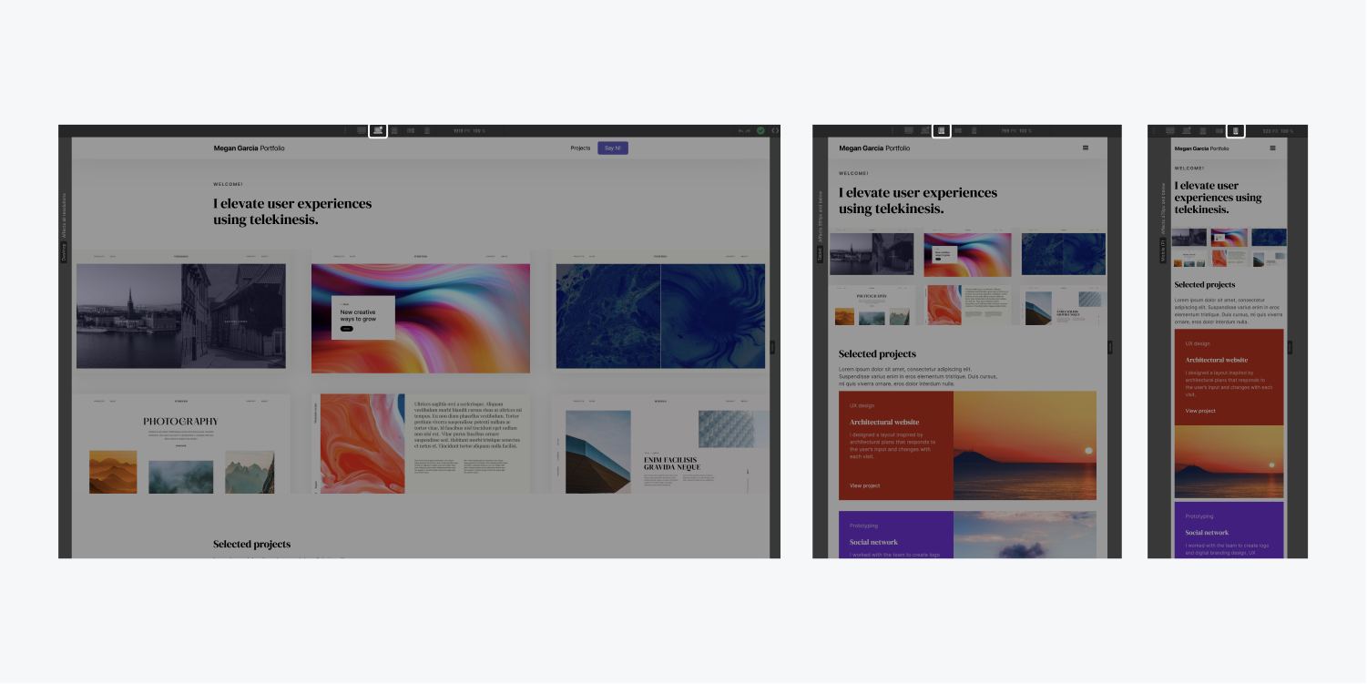
Webflow’s exclusivity lies in its visual design editor:
With the vast library of pre-built elements like headings, paragraphs, images, and forms, you have complete leverage to make the necessary advances. Moreover, these are drag-and-drop elements that make our tasks even simpler.
Once you have added all the elements based on your free design template, you can now customize it. To access the style panel, you simply need to double-click on any element. Here, you will get complete customization features like font, color spacing, and more. Moreover, you can also add customized animations and interactions to make the webpage look more dynamic.
You also get the option of sections to organize the content on the page. You can start the sections vertically and use the pre-built layout grids to ensure a balanced and responsive design.
A clear and intuitive navigation menu is critical for any website. With Webflow, you get different navigation styles, allowing you to create menus that easily integrate with the overall design of your website.
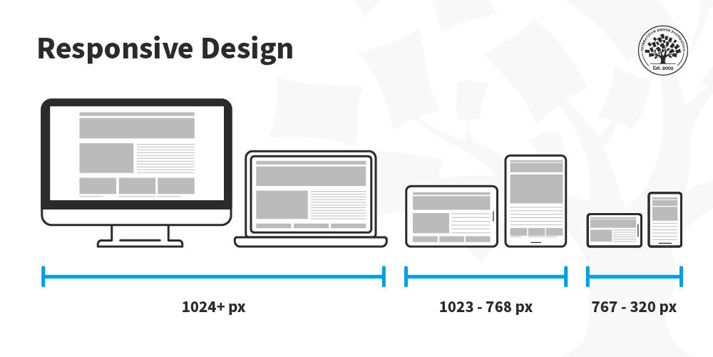
Pro Tip: Utilize Webflow's responsiveness features to ensure your website looks perfect across different screen sizes (desktop, tablet, mobile).
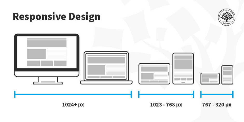
Now that you have created the website design let’s move down to making it responsive and suitable for different screen sizes. You can adjust the layout and the elements based on the size of the screen and the device that will be used. This ensures optimal readability, better navigation, and enhanced user experience.
Webflow offers a number of features that will help you achieve a responsive design. These include:
These are predefined screen sizes, such as tablet, mobile, or desktop. It will help you adjust your website layout for optimal viewing and readability as per the device.
The great system on Webflow helps you define the layout and adapt it to different screen sizes. Elements within the grid can be set to percentages or viewpoints for automatic resizing.
If you are planning to achieve the best responsive design for your website, you can choose pixel rates, but there are better options like percentage or point units. It ensures that each element scales in proportion to different screen sizes.
Defined a breakpoint for different devices. Click the designer view and the menu icon on the top left corner. Choose the breakpoints and choose the predefined options. You can also set custom points as required.
After setting the breakpoint, you can refine the website layout for each device size further. For example, select a breakpoint like a tablet and adjust the element's weights, padding, and margins to optimize the viewing experience on the specific device.
In addition to an array of features, Webflow also offers a responsive navigation menu that automatically adjusts the layout based on the screen size.
Make sure that images and videos are responsive. You can do this by using web plus built-in options. Additionally, upload different-sized versions of the same image, and Webflow will pick up the most suitable version based on the user’s device.
Webflow's built-in preview mode allows you to see how your website looks on different devices. Use this extensively to test your responsive design and make any necessary adjustments.
Consider adopting a mobile-first design approach. This means designing your website for mobile devices first and then scaling it up for larger screens. This ensures your website prioritizes optimal user experience on the most widely used devices.
Pro Tip: To make your designing process easier, Webflow offers a number of learning resources and tutorials. Explore this detailed tutorial on creating a responsive design with Webflow to gain a deeper insight and understanding of the platform
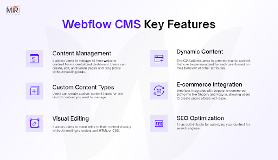
Once you have created a website, it’s time to manage the content. Webflow CMS enables you to manage the website content without getting into the depths of coding. Here is how it works:
Create collections of different types of content, like blogs, newsletters, product listings, etc. Define the field of the content for each collection, like adding the title, image, and description.
You can also add new content items to your collections with the Webflows interface. It also provides you with the ability to edit, update, and delete content as required.
You can create dynamic pages that update, wherein you can automatically update the content. This feature is good for blogs, portfolios, or e-commerce websites with frequently changing content.
Pro Tip: Webflow CMS offers basic SEO optimization features. Integrate relevant keywords into your content to improve your website
With these simple steps and the powerful features of Webflow, you can create a website that offers an amazing user experience on any device.
Whether you are running an e-commerce store, a blog post, or a website offering services, with Webflow, you have the power to design a website that builds a strong brand image and creates an instant connection with the user.
The right kind of website design and its seamless navigation across different screens ensures better consumer engagement that eventually drives organic traffic. Moreover, responsive web design helps you attract potential customers and claim conversions.
.svg)


REGISTERED IN Chennai, INDIA.
"Global Team, Building for the world"


.webp)
.svg)